Digital Marketing for Events: Optimising Your Event Landing Page for the Best Conversion Rate
Your event landing page is where you send visitors when you want them to sign up. The page has one goal – convert your website visitor into an event visitor. Most people will likely enter your site through your homepage, the landing page is where they convert.
Think of your homepage as the entrance to your event, the registration page is where they buy the tickets. Imagine that your event is next door to several other events that the user can sign up for at any one time. What can you do to make sure that it is your event that they sign up for?
In this blog, we run through best practices for event landing pages that we’ve gleaned from working on ad campaigns for some of the UK’s biggest and best-loved events. We’ve also included screenshots for inspiration. We hope you find this useful!
-
The Basics
As a minimum, your visitors will need to know when and where. This information should be readily available as soon as they land on the page. Make sure it is clear:
-
When your event is.
-
Where your event is being held, e.g. venue, city, county. Consider including maps, directions and links to travel info. Where the event is will often be key.
-
Who your event is for. This may seem obvious from the name of the event, but a tagline such as ‘the UK’s leading travel trade event’ will reassure users that this is the right event for them. Similarly, if you are hosting a free event, you don’t want people to sign up if the show is not aimed at them.
This information is easy for you to find, but invaluable to visitors. Users want to know they are in the right place if they are going to commit to signing up. You might find it useful to consider the persona of your visitors: Who is your visitor, what do they want to know? Is your event niche, or is it more general? Make sure your target audience knows that they have come to the right place.
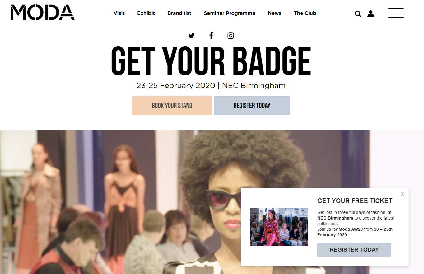
MODA does a great job of making the essential event information clear and available on the homepage. They also include a stunning video banner to give potential visitors a glimpse into what to expect at the show.
-
Call to Action
Your CTA needs to be clear and simple. Anyone making the decision to sign up there and then will want to have quick access to sign up. Make the CTA button a different colour to the rest of your content if possible so that it stands out and the eye is drawn to it. Buttons should be on the right of the page where the eye is naturally drawn.
If possible, have your CTA button always accessible. If you need to include a lot of information on your page, meaning users have to scroll down, consider using a sticky button or navigation bar that follows users down the page.
http://www.ceramicsexpousa.com/
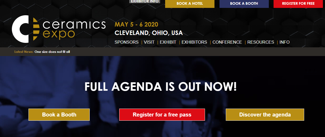
Ceramics Expo makes it very clear where they want users to click – the red Register for a free pass button. A horizontal Register Now button also follows users down the page as they scroll, giving users easy access to continue their booking journey.
-
USP
If you can’t explain why someone should go to your event in one sentence, it’s probably too complex a sell. The person coming to your page is already interested in your event and likely a key demographic (if you’re attracting the right audience to your landing page), it’s up to you to seal the deal. Use short sentences and compelling language.
What makes your event worth going to more than any other; is it your speakers, quality of attendee, are visitors missing out by not attending, does the price increase if they wait to sign up, are there limited tickets, what date did tickets sell out last year? You could even use a countdown timer to the event or when certain sale points pass.
Visitors want to know:
-
What is on offer at your event?
-
Why does it benefit me?
-
Why do I need to register now?
-
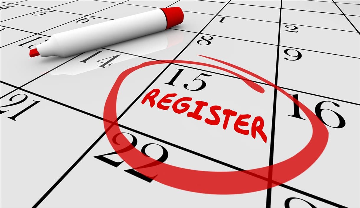
How do I register?
https://www.terrapinn.com/exhibition/spark/
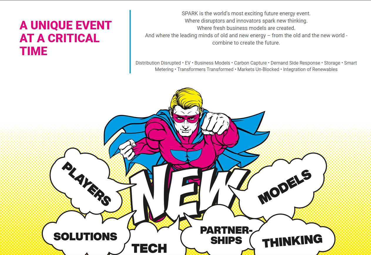
SPARK presents its USPs in a unique and eye-catching way, which perfectly reflects the branding of the show.
-
Sign Up Form
Keep it as simple as possible. You might be tempted to capture as much data as you can about the users, particularly if your event is free. However, long forms that request unnecessary information are likely to put users off. Once confirmation is complete, provide links and a prompt to share your event (and their attendance) on social media. You don’t want people leaving your page without converting, but once they have converted, turn them into advocates.
https://www.festivalofmarketing.com/
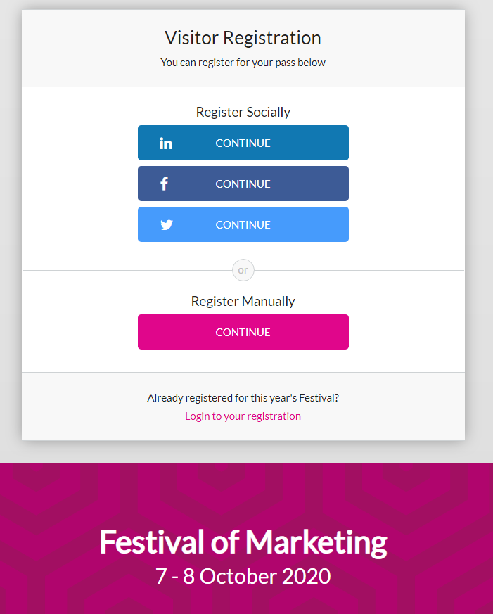
Festival of Marketing allows users to Register Socially, speeding up the registration process by pulling in data from social profiles.
-
Images
Pictures speak louder than words, so the cliche goes. Show images of people enjoying your show, visitors smiling and looking engaged. You could also brighten up your page by including images of renowned speakers, sponsors or attendees to offer up proof that your event is worth attending.
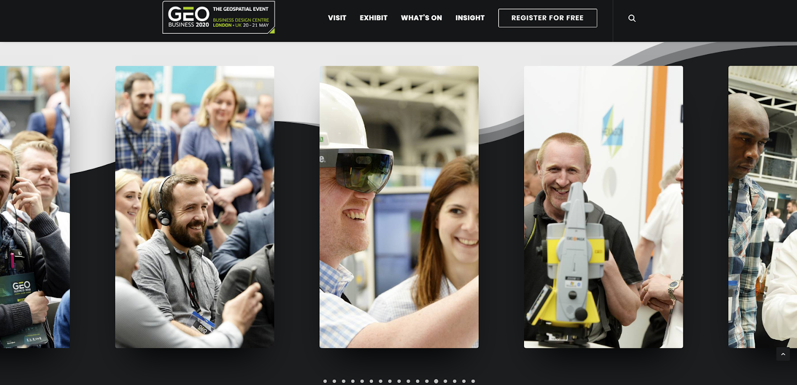
https://www.geobusinessshow.com/
GEO Business includes a user-friendly gallery of images showing various elements of the event, including speakers, exhibitions and visitors enjoying themselves.
-
Usability
Keep the page simple so that visitors are able to complete the desired action without getting frustrated or distracted. Analyse this journey objectively and also ask people unfamiliar with your site to visit your page and feedback on their experience. If you want a third-party opinion, there are online options, some of which are relatively cheap. We have used userbob in the past and found it a quick and affordable way to get impartial feedback.
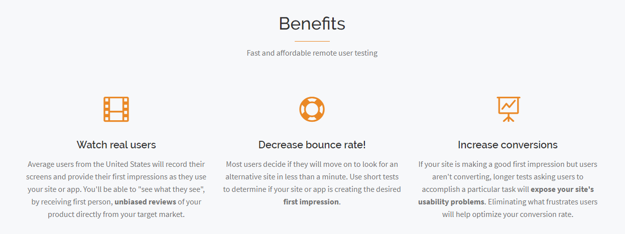
Userbob have a simple process for user testing and flexible pricing if you want to try them out before investing too much in the tool.
-
AB Testing
All the factors listed above can make or break your event. If possible, you should be testing everything, such as the colour of register buttons, etc. Google offers a free tool that makes AB testing easy and free, without the need for development work every time you want to run a test.
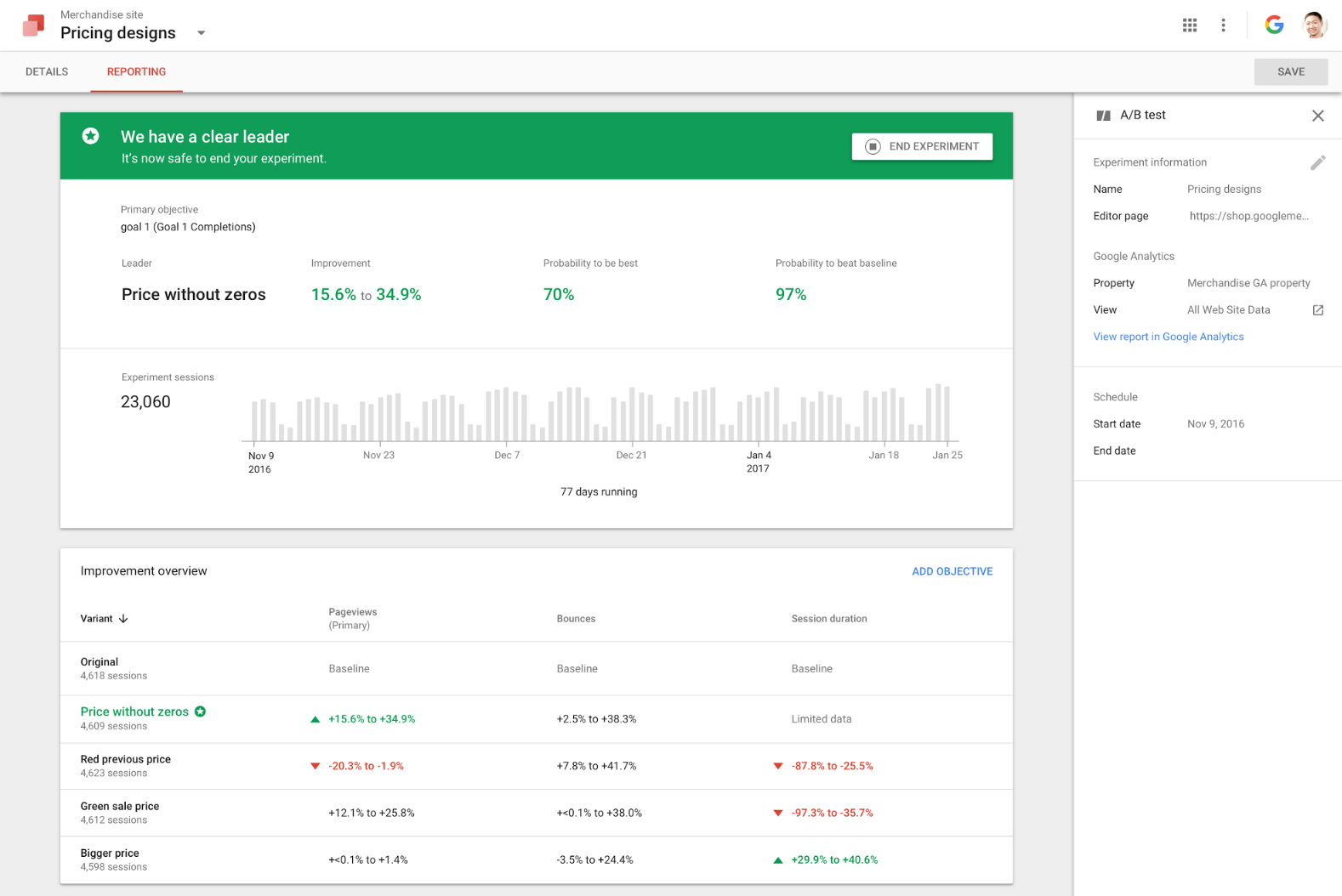
Google Optimise is simple to install (you can even do this through Google Tag Manager if you have this installed on your site) and use in your browser. Experiments can be set to run as long as you need them to.
-
Mobile-first
Check your Analytics. Does the majority of your traffic come from mobile? If it does, you’re certainly not alone with mobile visitors overtaking desktop for a lot of websites and industries. You need to make sure users can easily access your website no matter what device they use. Make sure that you test the user journey, including how images, buttons and forms appear on mobile devices as well as desktop. There are free online browser tools such as http://whatismyscreenresolution.net/multi-screen-test, which provide an easy way to check how your site appears on different devices.
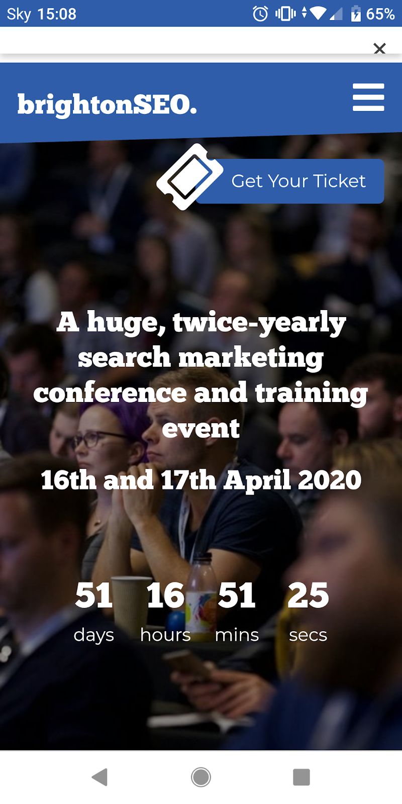
BrightonSEO has a well-designed responsive site that keeps the essential details and Get Your Ticket button above the fold on all devices.
Bonus Tip – Remarketing
If your visitor doesn’t convert on this occasion, you’ll want to know why and have the ability to re-market to them. Make sure you have remarketing audiences set up for your advertising platforms so that you can send personalised ads to convince those users to register.
If you have questions about optimising your event landing page for conversions, or want help setting up campaigns which will drive registrations for your event, get in touch with MCM Net on 01732 368120 or contact us here.