Web Design Trends in 2018
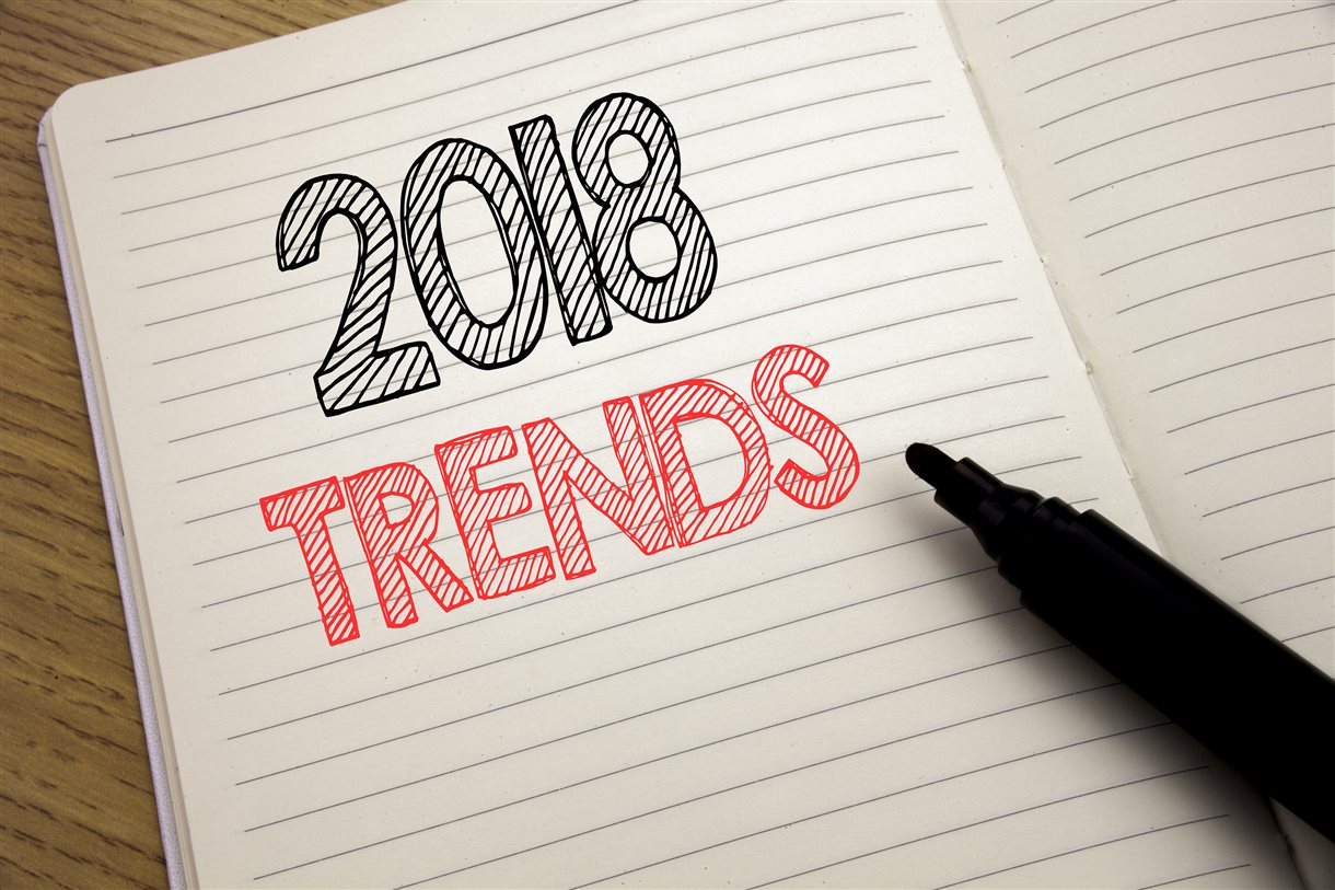
There have been many notable innovations and trends in web design that have appeared in the last 6 months. With the web being one of the fastest changing parts of modern society, it is often hard to keep up with what’s what in the industry. Well don’t worry, MCM Net have done the hard work for you and compiled some of the main trends of the year so far, to help you stay ahead of the web design game.
Geometric Shapes and Custom Graphics
2018 has seen many websites incorporate different shapes into their websites to create eye-catching styles and patterns. We particularly loved Vitalmar’s uniquely shaped home page, compiled of multiple square diamonds:

Source: http://www.vitalmar.com.br/
On the topic of graphic design, we have also seen the rise of custom graphics this year. Whether they are small icons, illustrations or characters to make the page more personable, they are definitely something you should consider investing in soon. Headspace is a favourite of ours, incorporating their stylised characters throughout their branding:

Source: https://www.headspace.com/
Kick Point, on the other hand, is a really nice example of a simple way to include icons, using them to spice up blocks of text and quickly explain what each section is about to the reader.

Source: https://kickpoint.ca/
Drop Shadow
On the topic of graphic design, we are starting to see more depth being added to websites with the use of drop shadows. This simple technique helps to make items stand out, especially when overlapped with other elements. Upperquad shows how this can help add something extra to more minimalist websites, as well as being a great example of geometric design.

Source: https://upperquad.com/
Colour
Colour is becoming a more and more important part of web design. Reflective of more broader trends, it can be split into three sections:
Pastel
Harking back to the colour palettes of the seventies and sixties, this trend is very a la mode, reflecting current fashion trends. Dom Jacob’s website uses these colours in blocks, using slightly clashing colours to create a retro feel.

Source: http://domjacob.co.uk/#work
Bright Colours
Super eye-catching, this colour palette contrasts with the pastel theme above. Bose’s website again uses colour blocking, this time to highlight different products. It is also an interesting take on the diagonal section breaks that have been appearing on websites over the past year.

Source: http://special.bose.eu/fr/
Gradients
Reminiscent of your favourite WordArt styles when you were 10, gradient is making a comeback on the web. A different way to display bright colours to just colour blocking, it gives a really futuristic feel to your website, as can be seen on OpenAI’s homepage:

Source: https://openai.com/
The Minimalist Look
In contrast with these colourful trends, minimalism is starting to appear on the web, having crossed over from other industries such as interior design. This pared-back way of presenting your website looks very cutting edge and high fashion, letting the content do the talking. Whilst Amann Salon’s website isn’t the most basic version of minimalist design, the limited colour palette shows how you can achieve this more simplistic look without having to sacrifice on content and information.

Source: http://www.salonamann.de/
Animations
Moving away from the different ways colour has been influencing web design this year, small animations have also been cropping up everywhere. They really help to make a website more dynamic and add an extra element to your site. For instance, Peppermint’s dainty little animations really bring the site to life and are much more interesting than static images:

Source: http://wybieramyklienta.pl/en
We are also seeing the reappearance of GIFs on websites. Whilst they are still more the forte of social media and photojournalism sites, notably BuzzFeed, the fact that Google recently bought a prevalent GIF company suggests that if they don’t make their way into web design over the rest of 2018, they will be appearing more and more on your favourite sites (including yours?) in the coming years.
Editorial Photography
There has been an emphasis on still pictures too. More stylised professional pictures have been appearing on websites and, paired with a minimalist feel, give an editorial vibe to sites. Working especially well for e-commerce sites, high-quality images give websites a high end, luxury aesthetic. The example below from Bath+More is a fab example of how minimalism and editorial photography can be a really chic way to sell your products with minimum text – let the pictures do the talking!

Source: http://www.bath-and-more.ch/
Broken Grid Layouts
Another way to give your website a more editorial feel is to give your website a truly 2018 layout. Ignore everything you were taught about following the grid in graphic design school and break all the rules. More and more web designers are pushing the boundaries when it comes to organising their websites: items are being overlapped and things aren’t in line, creating a very futuristic almost scrapbook feel (as can be seen on Michael Nelson’s website).

Source: https://michaelnelson.co.ke/
This is also where drop shadows can come into their own, adding depth to these overlapped sections, as demonstrated on TechStyle’s website:

Source: https://techstylefashiongroup.com/
Mobile Friendly Designs
On the topic of layouts, the overtaking of mobile as the web viewing platform of choice has caused a flip in what style of design is most important. Whilst websites were designed for desktop and then adapted for mobile, more and more websites are being designed with mobile in mind and then altered for desktop. This can be seen in the increasing prevalence of ‘Burger Menus’, which originated in mobile adaptations of website, but are now being integrated onto desktop versions of sites too, as can be seen on Newton Running’s site (which is a great example of many of the trends we have mentioned being integrated together on one website):

Source: http://runbetter.newtonrunning.com/products/gravity-iii
Typography
The final trend we have seen so far this year is a more creative use of typography. Serif fonts are starting to crop up everywhere, bucking the long-term use of sans-serif fonts. A great example of this is SFCD’s site who use serif fonts throughout their home page:

Source: https://sfcd.com/
There is also an increasing use of custom fonts, going hand in hand with the custom illustrations we talked about earlier. A favourite example of ours is Elegant Seagull’s site, which features a multitude of fonts in different sizes and at different angles. It’s also another great example of a scrapbook style, broken grid layout.

Source: https://www.elegantseagulls.com/
As you can see, 2018 is really seeing the increase in creativity in web design, with designers across the world really pushing the boundaries of what they can achieve. With a real move towards more editorial and scrapbook style sites, as well as a lot of colour play, there has never been a more exciting time to redesign your company’s website. If you are inspired to start renovating your website, be sure to contact MCM today to discuss what our web designers can do for your site.